The Challenge
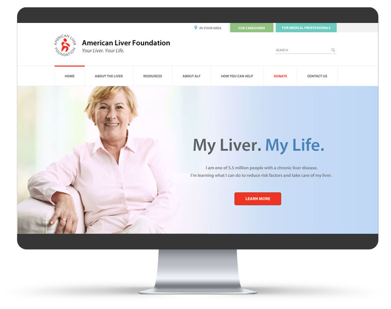
The American Liver Foundation wanted to reinvent the way they presented liver disease information online. Most importantly they wanted to improve the experience the people ALF serves have when they visit the website. As ALF put it, “the lens we see this website through must be from a users point-of-view.”
Most users find ALF through a simple online search. What they find when they arrive there will impact whether they are willing to return for more information, navigate elsewhere in the website to explore other information, get involved with the ALF, make a personal contribution to the cause or even consider ALF as a credible source of information.
Top four goals of ALF for their website redesign:
- Make it easier for site users to find relevant information.
- Refresh the ALF brand and what it represents.
- Provide more compelling content.
- Make the site mobile responsive.
The Solution
I worked closely with Andre Paquin, the ALF project lead to identify the best approach to simplify and streamline a very content heavy and information-rich website. It was key that the three primary audiences, Patients, Caregivers and Medical Professionals all had access to the resources that ALF had to offer. I designed a user interface utilizing three complementary colors to help users to know which section of the site they were in and made refinements to the labeling and structuring of the site map.
I also created a new refreshed and more humanistic look and feel to the site graphics and designed custom icons to be used throughout the site. I crafted, My Liver. My Life. and Your Health. Our Mission. to provide compelling brand messaging.
I also designed templates for use by ALF local divisions to maintain brand integrity nationally.